In a new collaboration, we helped a boutique law firm reimagine their brand identity.
In a new collaboration, we helped a boutique law firm reimagine their brand identity.

Redefining prestige for a new generation of legal excellence
The Challenge
Caldwell & Price came to us at an inflection point. After two decades of steady growth, this boutique international law firm had built a formidable reputation in corporate litigation and cross-border transactions. But their visual identity—staid, traditional, indistinguishable from countless other law firms—no longer reflected the sophistication of their practice or the caliber of their clients.
They needed a brand that could command respect in boardrooms from London to Singapore while signaling a more progressive, strategic approach to legal counsel. The challenge wasn't just aesthetic—it was about positioning Caldwell & Price as the firm for clients who expect more than precedent and procedure.
The Approach
We began with extensive stakeholder interviews across their London, New York, and Hong Kong offices. What emerged was a firm that operated differently: smaller teams, deeper client relationships, faster response times, and a willingness to challenge conventional legal thinking when it served the client's interests.
Our strategy centered on a simple insight: boutique doesn't mean smaller ambitions, it means smarter focus. While large firms offer breadth, Caldwell & Price offers precision—the right expertise, the right team, exactly when it matters most.
This became the foundation for everything that followed.
The Identity
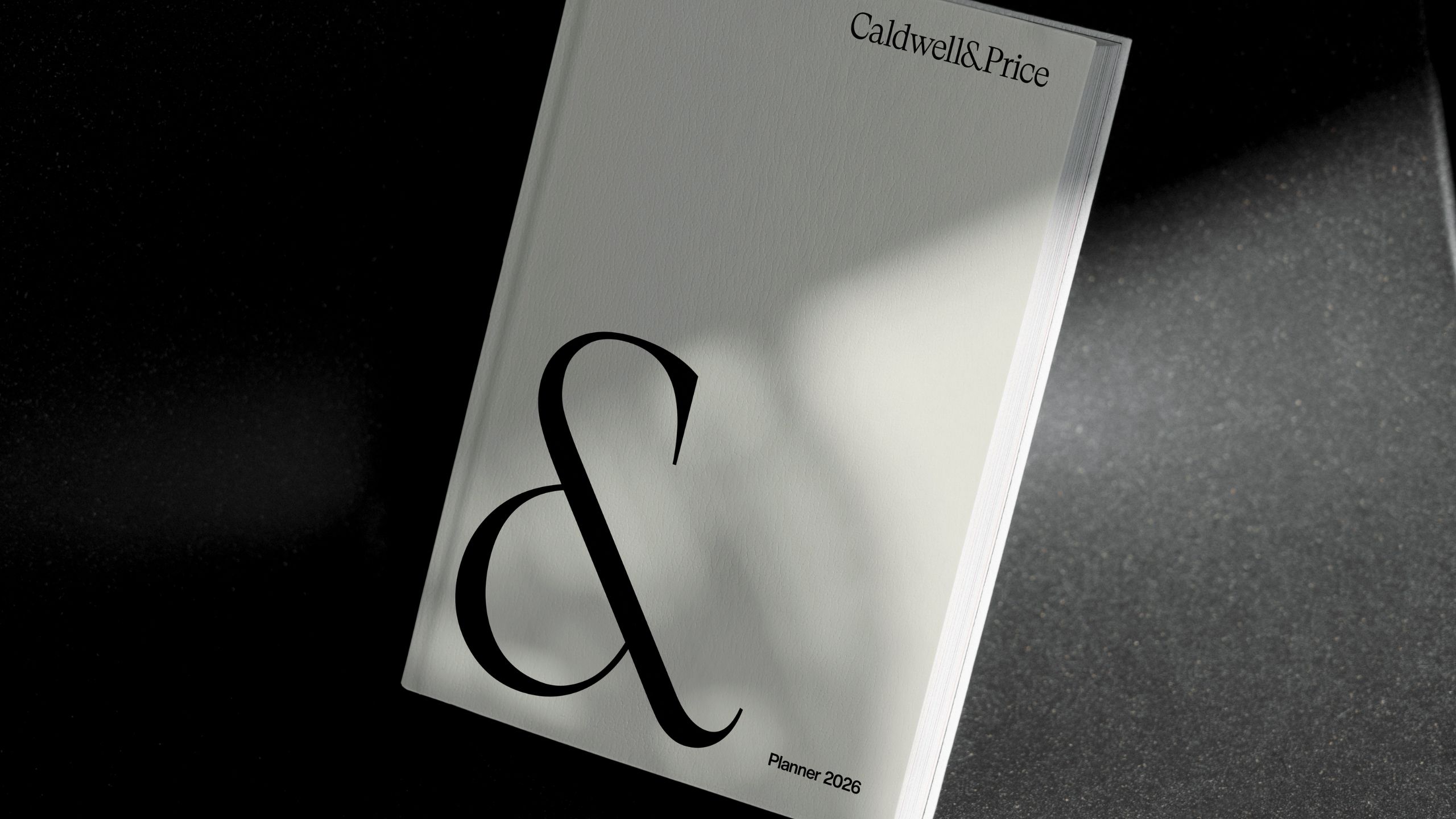
The visual system we developed reflects confidence without arrogance, tradition without stagnation. A refined monogram serves as the identity's anchor—elegant, memorable, and adaptable across contexts from business cards to building signage.
The typography is deliberately restrained: a classic serif for the wordmark paired with a contemporary sans-serif for body copy, creating a balance between heritage and forward momentum. The color palette moves beyond expected navy and burgundy, introducing deep charcoal, warm ivory, and a distinctive bronze that suggests both gravitas and warmth.
We designed the brand to feel tactile and considered. Embossed details on stationery, subtle texture in digital applications, and careful attention to white space all reinforce the message: this is a firm that sweats the details because details matter.
The System
A comprehensive brand guidelines document ensures consistency across all touchpoints while allowing flexibility for regional office customization. We developed templates for pitch decks, legal documents, and internal communications—transforming everyday materials into brand ambassadors.
The digital expression extends the physical identity with the same attention to craft. Smooth micro-interactions, generous spacing, and strategic use of the bronze accent create a digital presence that feels premium without being precious.
The Impact
Since launching the new identity, Caldwell & Price has reported increased confidence in client pitches, with several partners noting that the rebrand signals their evolution in a way that opens doors previously closed. Recruitment has strengthened—top legal talent is drawn to a firm that looks as progressive as it acts.
More importantly, the brand now reflects what was always true about the firm: they're not trying to be the biggest. They're committed to being the best at what they do.


